
DBMSC Steel
Overhaul of the complete website
Introduction
DBMSC Steel is one of the leading steel providers in the region. However their online presence felt like it wasn’t catching up.
The Concept
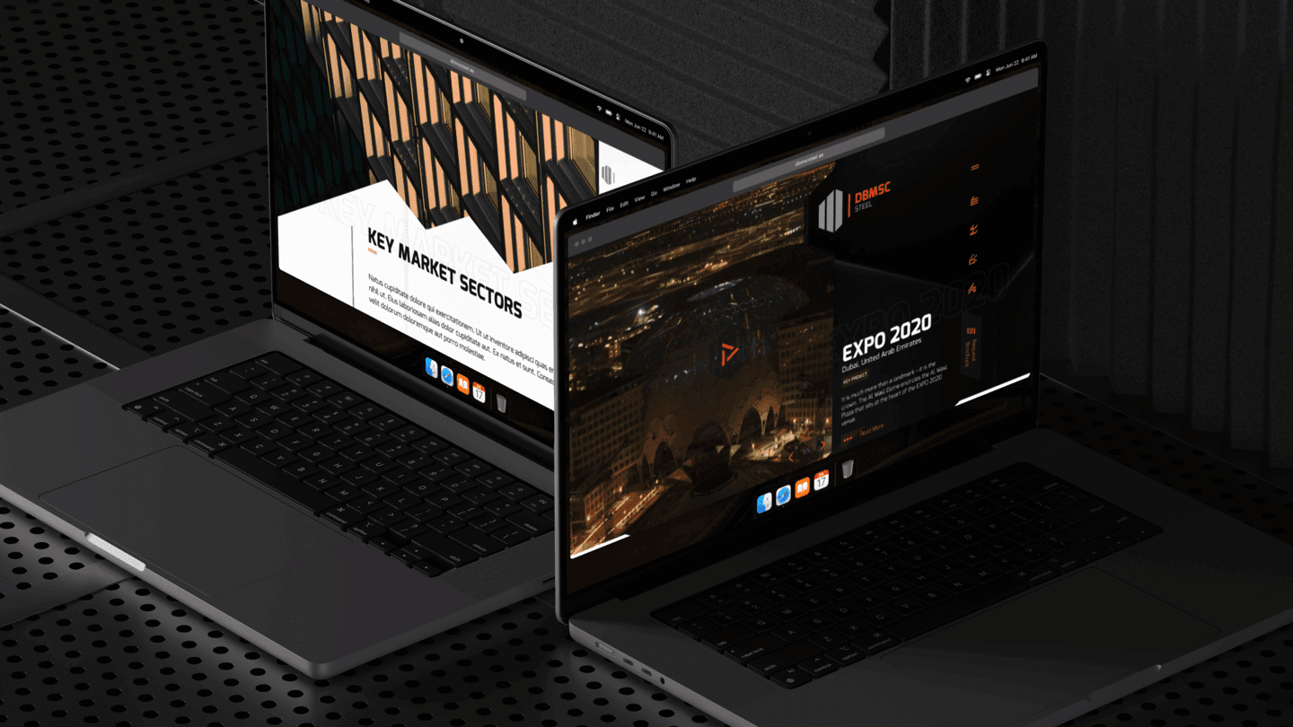
Tasked with modernizing their website with the right target and customer fit in mind, I started with research into their current customer base, how do they approach the brand and what are other processes involved to the point of sale.
The Problem
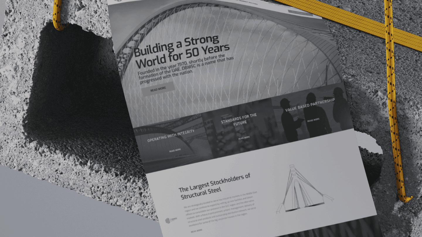
Navigation
Users struggle due to poor navigation and organization.
Poor representation
Products poorly showcased, reducing visibility and sales.
Case Studies
Key projects aren't prominently highlighted, reducing credibility.
Aesthetics
Website lacks engaging visuals and interactive features.
Lead generation
Infrastructure lacks efficiency in leveraging customer information.
The Objective
The goal was to fix issues, grow the brand, enhance visibility, and serve as the base of information on social media, as well as improving user experience and discoverability. All the while help generate leads who can then connect with the sales team one on one.
Goals
Awareness
Make the presence known to the general public of a company based in the Middle East with good community connections.
Reach out
Connect with local as well as international potential customers including those outside the current industry serving parameters.
Connect
Get in touch with decision makers, suppliers and vendors. Provide an easy way to connect to the sales staff as well as acquire relevant litreture.
Potential Employer
Appear as a potential high energy all inclusive employer for the local and expat population of UAE.
The Process
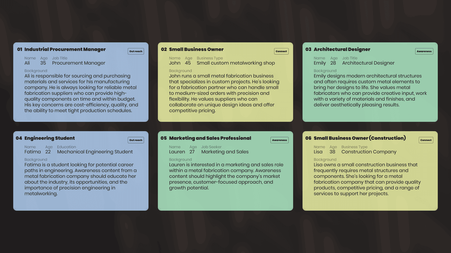
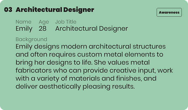
Personas
As a means to serve the clients and customers, I worked with the digital agency and the brand to figure out the personas that would represent their clients so we can tailor the experience accordingly.
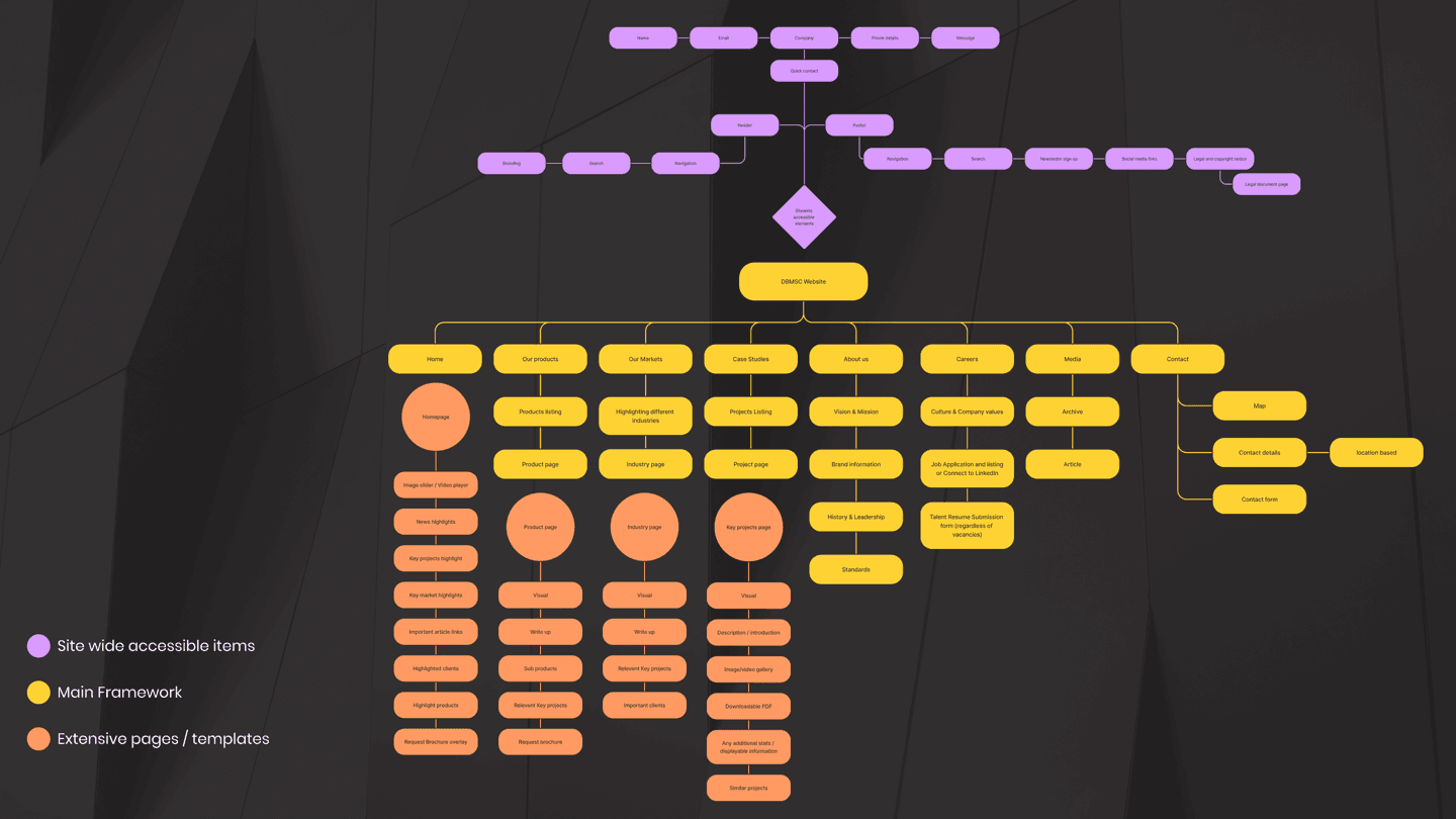
The Map / Structure
Amended the already available information architecture using the research we acquired during this exercise. It also took into account ease of use, content and product discoverability as well as cross linking key projects for better showcase.
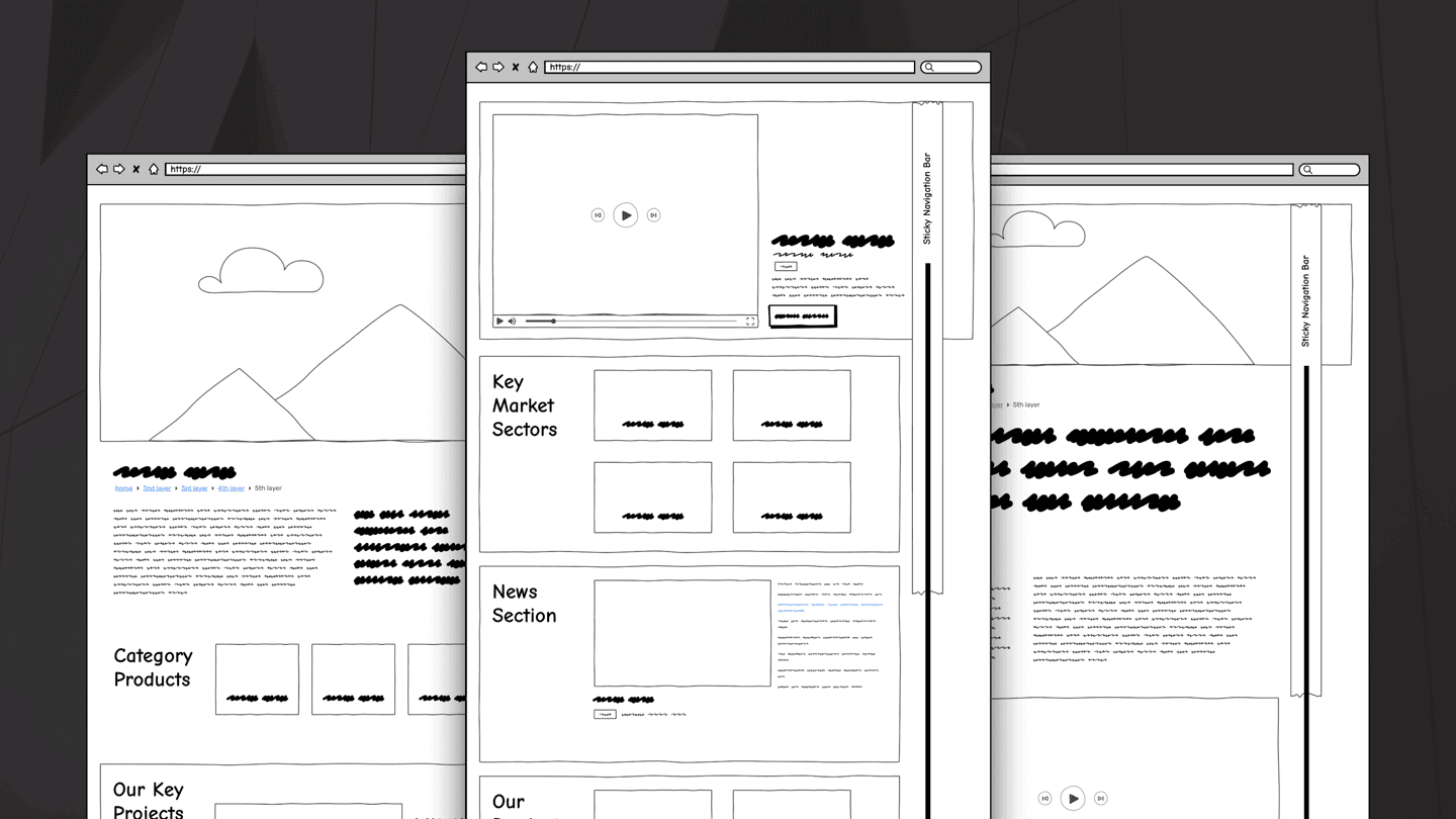
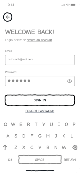
Wireframes
The wireframes were made with prototyping and A/B testing in mind - so this goes without saying, we went through a few iterations before going ahead with the current one - there were further tweaks when it came to design as well.
Parallel Efforts
Once the structure, user journey and wireframes had been locked down, work on the style guide as well the website began, the style guide kept being build in parallel to the website. Both these efforts were kept open ended in terms of aesthetic guidelines, so that once this is locked down, it can be carried forward with other initiatives using this exercise as the guide line.
The Styleguide
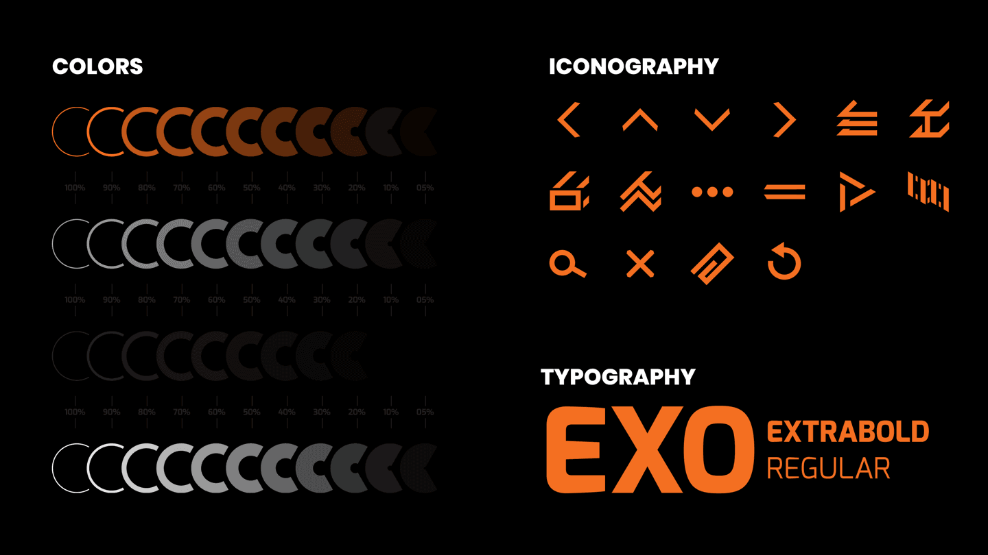
Colors
The base palette was provided by the brand however it was broken down further with different opacities to be used thoughout the website.
Iconography
The icons was designed from scratch, based on elements used across the website, as well as representing some of the products.
Typography
Exo Regular and Extrabold was selected from the catalogue of Google Fonts. It paired with the brand perfectly and as a bonus relived us of the headaches of managing a third party font subscription.
Final Product
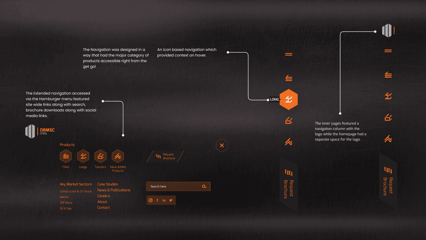
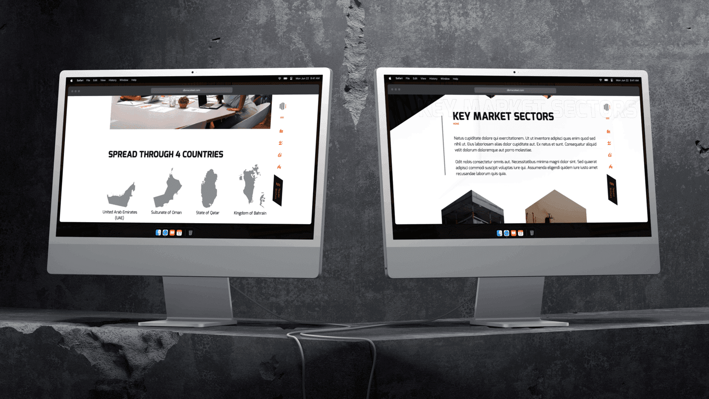
Navigation - Desktop
Custom elements for navigation and extended navigation items.
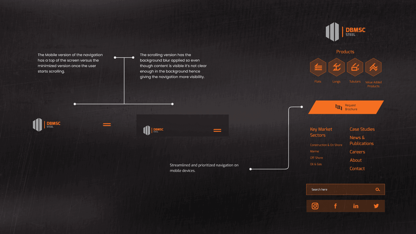
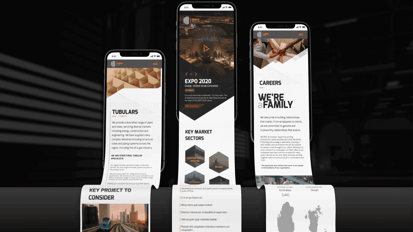
Navigation - Mobile
Custom elements for navigation and extended navigation items.
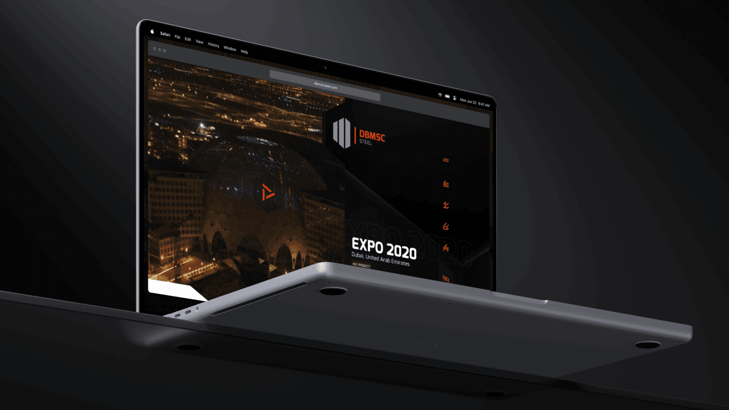
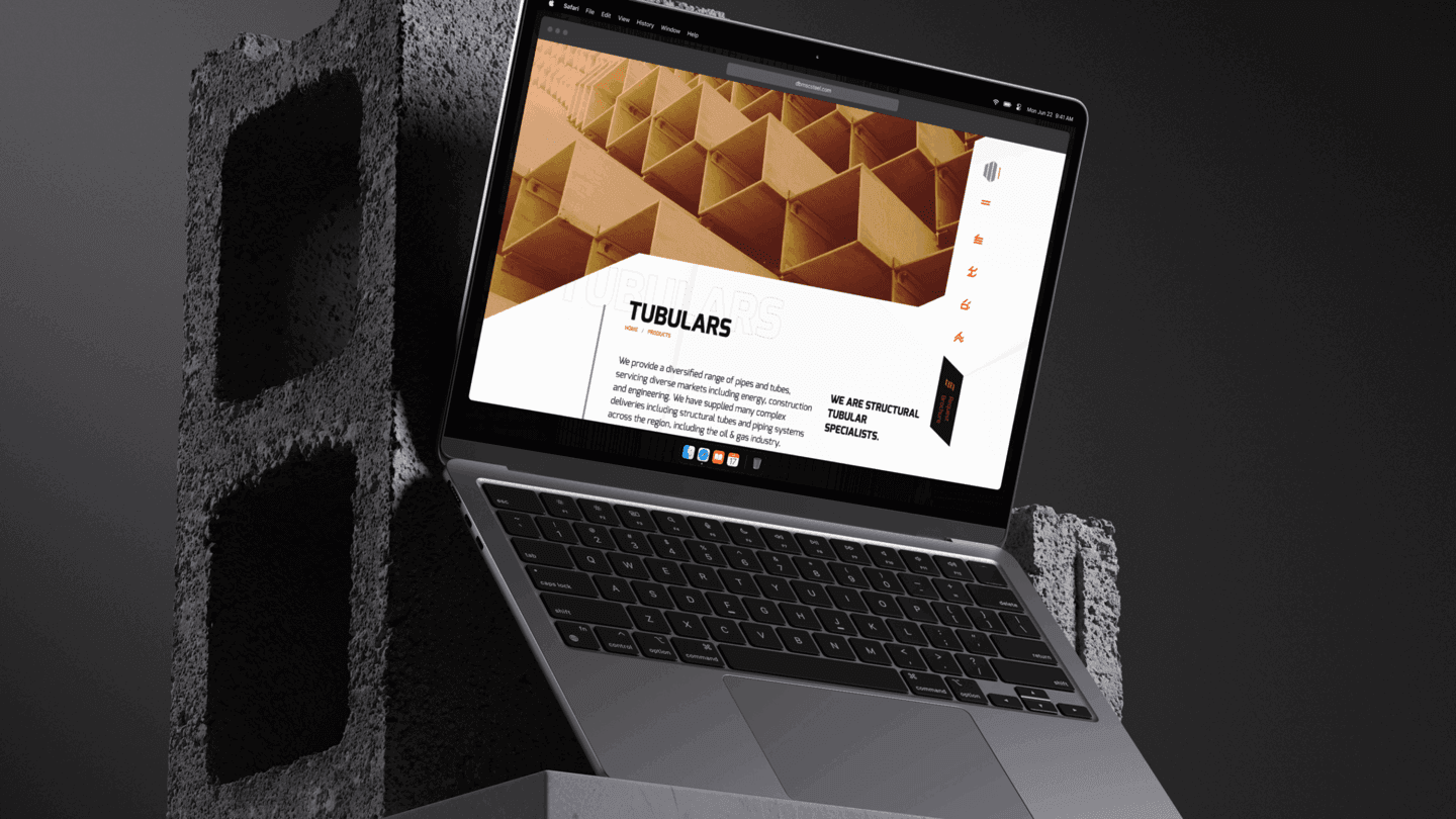
Live
In Action
In Action

Set up a quick call.
On me.
On me.



ADTV
Overview
UX / UI

Mind Box
Overview
Landing Page

One Development
Overview
Landing Page UI
VK Exhibitions
Overview
Dashboard UI

Tria
Overview
UX / UI

Nat Geo Al Arabiya
Overview
UX / UI (Apps)

Pure Harvest
Overview
Landing Page UI
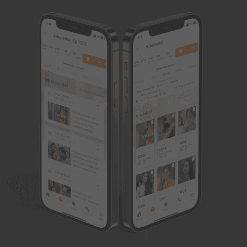
Zee TV ConteNXT
Overview
UX / UI

Epeexx
Overview
UX / UI
Why Hire Me
A seasoned UX Designer with a background in UI design and an eye for technical feasibility.
15+ years of Work Experience in a range of industries, including
Crypto & Fintech, Social Gaming, Corporate Products, Transportation Tech, OTT & Radio Platforms & Digital Transformation.
More of me, elsewhere
A head on approach to challenges and an encouraging attitude towards problem solving, I favour data over personal preferences, testing intuition with results.
If that sounds like your kind of collaborator: reach out to scope a project, check availability, or just say hi.
If that sounds like your kind of collaborator: reach out to scope a project, check availability, or just say hi.
More of me, elsewhere














My Expertise

User Experience Design
User Interface Design




Design Systems



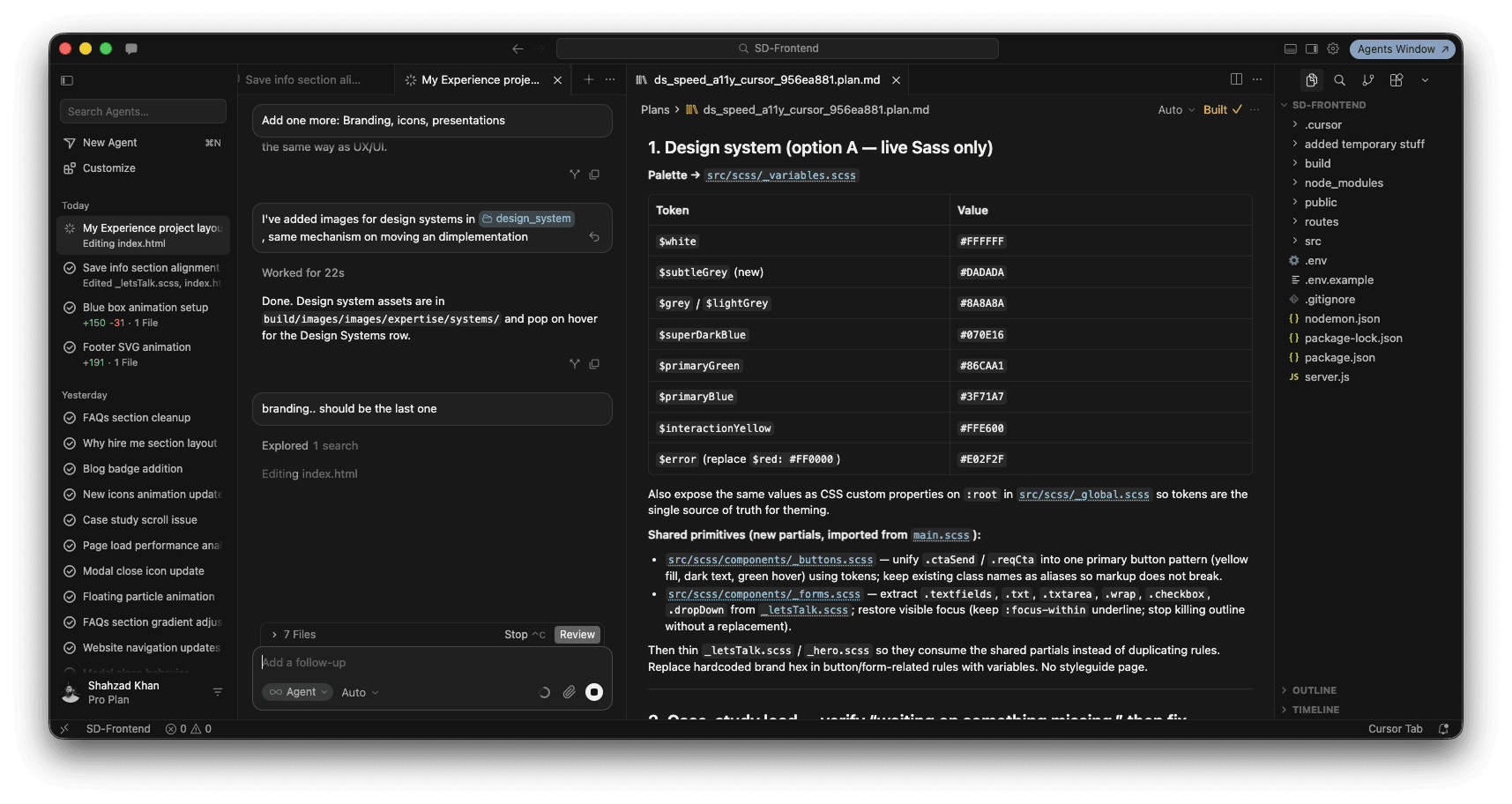
AI Assisted Development






Branding, Icons, Presentations
Some FAQs
Let's Talk!







Set up a quick call.
On me.
On me.